Free Your Stuff
UX Design.
Overview
There is a lot of waste in college towns because many students move in and out every year. Every Spring, usable furniture is found sitting in dumpster alleys, and every Fall, students rush to find items to fill their empty apartments. This is wasteful and unnecessary! I designed and prototyped a mobile app to connect people who need stuff with people who have stuff to facilitate resource sharing and reduce waste in the community. The name Free Your Stuff comes from a cultural movement I encountered in Germany aimed to reduce waste and decrease needless consumerism.
Role
UX and Interaction Designer
Time Frame
Jan 2017 - Apr 2017
Context
Course Project
Tools
Paper and pencil, Figma, Marvel
Skills
Interaction Design, Sketching, Storyboarding, Wireframing, Prototyping
Competitive Analysis
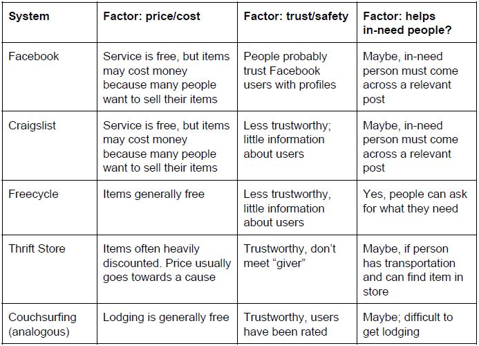
Before ideating, I wanted to see how the problem of unnecessary waste was currently being handled. I ran a competitive analysis, thinking about both digital-based (Facebook, Craigslist, Freecycle) and physical-based systems (thrift stores), as well as an analogous system (Couchsurfing), which focused on a different problem but had similar qualities. I compared these systems by several factors:
- price/cost
- trust/safety
- whether it helps people in need
Forging connections with potential strangers can be fraught with danger, and users in need likely have a low budget, so I wanted to make sure my solution was trustworthy and low-cost, but also addressed users' needs.
I found that thrift stores and selling on Facebook seemed the most trustworthy because in the former case, strangers don't need to meet, and in the latter, users can view information about each other before deciding to meet. Freecycle was the most low-cost because items were given away for free, which removed one of the significant barriers to exchanging items.
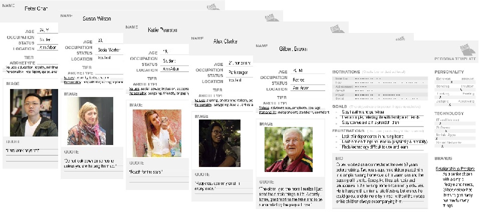
Personas
UX Design is not complete without considering users. To help with the design process, I created 5 personas based on my observations from following several Facebook Marketplace groups, including several that only exchanged free items. The personas I created represented different potential users of my design:
- a social worker
- an international student
- an undergraduate student living in a dorm
- a student living in a co-op
- a retired man in a nursing home
The last persona was an anti-persona, which described the users I was not designing for. These personas helped me step through scenarios as different personas to better understand how my solution could be designed and used by the user population.
From Ideation to Decision
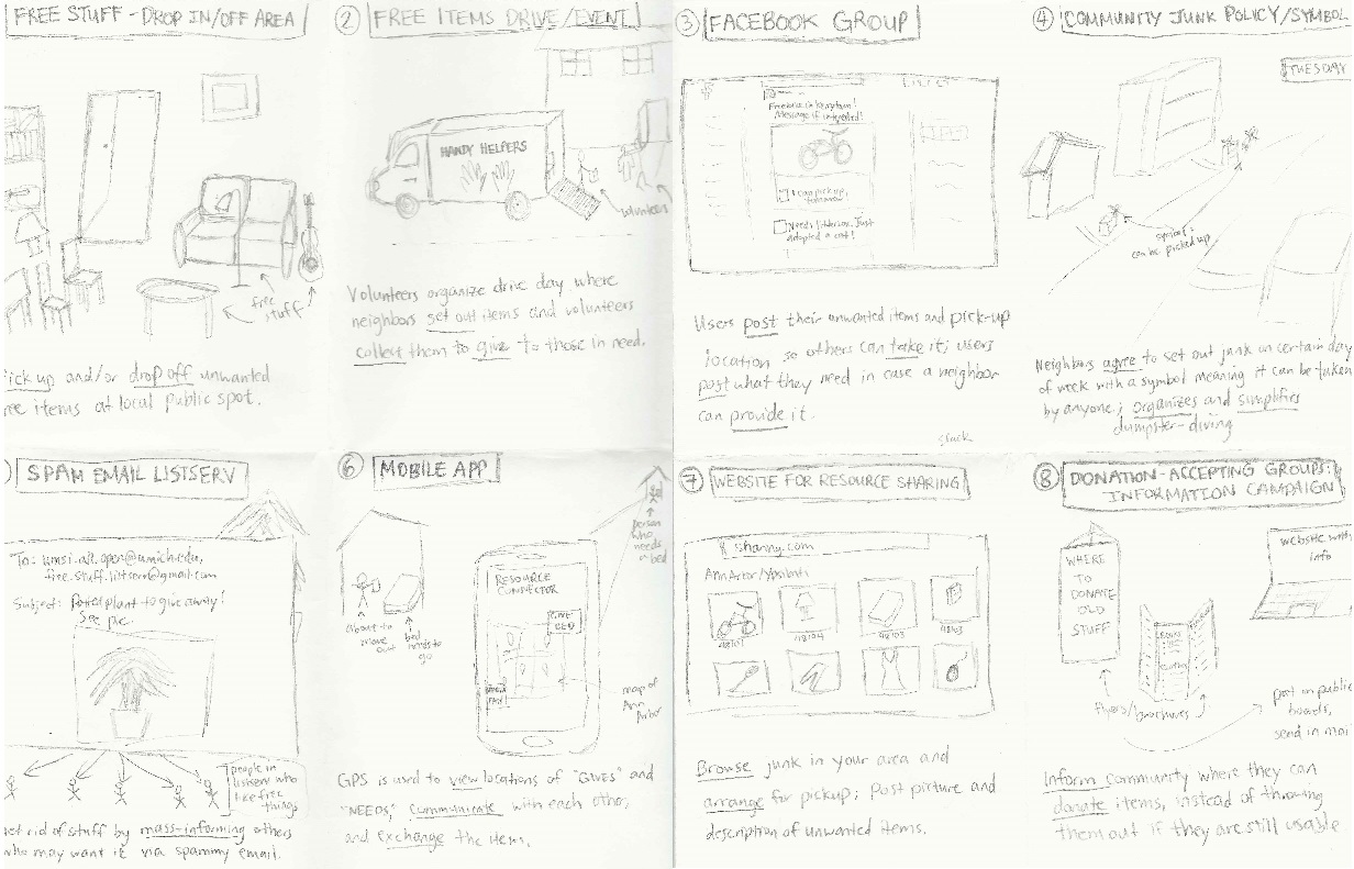
From the comparative analysis, I saw a diverse set of solutions, and had identified some advantages and disadvantages of each one. From the personas, I knew what kinds of users to design for. With this knowledge, I ideated: I brainstormed and sketched eight potential solutions, ranging from a free drop-off, drop-in location to a mobile app that connected "buyers" and "sellers." The focus was not on high-fidelity mockups, but on pencil sketches on paper that represented general ideas that could be expanded on later.
After my first eight initial sketches, I fleshed them out and sketched user stories. My goal was to think through a scenario for each solution. What steps does a user take to get an item they need? What about a user that is trying to get rid of an item? What is the context, the environment, and the interface like?
After much ideation, it was time to narrow down and make a decision on which solution I would prototype and present. One of the limitations of this project was that the course required us to select a digital solution, preferrably a web or mobile app interface, so even though I had come up with several non-digital solutions, I chose to create an app because of the course requirements. Without this limitation, I would have conducted more user research, such as contextual interviews and surveys, to learn more about users' needs and limitations, and my design solution would have been based on my findings.
Paper Prototype
After deciding to design a mobile app, it was time to consider the information architecture and the interaction design. I made a paper prototype to illustrate the initial interactions for my app. This was admittedly very challenging to me because it was the first time I had been asked to design an interface from scratch, so after completing my prototype, I recruited users to "test" it to gain feedback for my next iteration. I had users try to play with the paper prototype while I sat next to them and moved the paper pieces around to show them what would happen if they tapped certain parts. If certain parts weren't prototyped yet, I would verbally tell them what the result of a certain interaction would be.
This user testing was critical to my process! I learned:
- I was missing back buttons. (Yikes!)
- the home page, which was a static navigation page with 4 options, was redundant and confusing to users because every other page had a fixed bottom navigation.
- I needed to rethink the rating system. I wanted to make sure my app was trustworthy, so I had a rating system for each user like in Uber or AirBnb where trust is vital. However, because the app simply allowed users to message each other and arrange their own meeting time and pick up, the app would not know when and if a transaction had taken place, so they could not be prompted to rate each other after a transaction.
After this crucial feedback from users, I made the following design decisions:
- Add back buttons and label the page title at the top so people knew where they were and could navigate back.
- Repurpose the home screen to be a feed showing items available in the area, following design patterns in homepages.
- Introduce a "request" step to the exchange process, similar to that in AirBnB, where lodgers “request” to reserve a space and the hosts confirm. Having a reservation system would help other users know the availability status of an item. The app would also know when a transaction took place, so it could prompt users to rate each other, thus establishing a rating system for users.
First Digital Prototype
Using the feedback from my paper prototype, I created a mid-to-high fi digital prototype that I then tested with three users.
I found several issues:
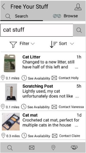
- Wording: Both users had a different expectation of what “See Availability” meant in the item listing. I had a clock icon to show that this had to do with pick-up time availability, but both users expected it to show them whether the item was still available to be given away, which makes sense. Based on this, I decided to change the wording.
- Icons: There were some problems with the icons in the navigation bar. Although the search and messages icons were intuitive, the other two were less so. I had an icon of a handshake representing "Exchanges, which I imagined would be where people can view their requested items, see their own listings, and receive notifications about requests. Because the handshake icon is not intuitive, one user suggested making small labels for the navigation. The other icon on the bottom navigation is the map icon, but both users deemed it unnecessary. Although a map interface is nice, I realized it could be integrated into the browse feature and removed from the bottom navigation.
- ISO users: I had not designed for how users in need can make a post about items they were looking for, which should show up on the feed and search results. One user pointed out that those posts would probably not have a picture, so using that space to write “ISO” (in search of) could be a way to indicate that this an ISO post and not a “giving away” post.
Revised Digital Prototype
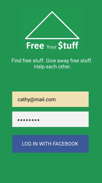
After two more iterations and more user feedback, I eventually produced a hi-fi digital prototype of my app.
Lessons
This was the first time I had prototyped an interface in detail, and I learned a lot! More specifically:
- Look at other applications to find design standards (ex. what does a home page look like) when designing from scratch.
- Never forget the back button!
- Test test test test test! I gained so much valuable feedback by talking to users trying to use my app.
- Hi-fi prototypes are time-consuming, so spend more time with lower fidelity prototypes to get the biggest usability issues out of the way efficiently.