Eye Disease Simulator
UX Research and Design
Overview
As part of a multidisciplinary team project, our team recreated an eye disease simulator mobile application that had previously been developed by a team of engineers led by our advisor. The app uses Augmented Reality to simulate how those with eye diseases see the world to educate others and increase empathy towards low vision patients. Our team's goals were to 1) improve the app's usability and 2) redevelop the app with Java. Our team consisted of one advisor, one UX Researcher and Designer (me), and one full-stack Android developer.
Role
UX Researcher and Designer
Time Frame
Sep 2017 - Dec 2017
Context
Applied Team Project
Tools
Paper and pencil, Illustrator, Marvel
Skills
Wireframing, Prototyping, Heuristic Evaluation, Usability Testing, Writing Reports
Background and Goals
In early 2017, a team of engineers worked with our advisor and a sponsor from the Kellogg Eye Center at the University of Michigan to develop a mobile application that simulated eye diseases. This team had conducted one interview with the sponsor, who was an ophthalmologist, to identify user needs and develop a product that addresses those needs. They discovered that:
- patients and eye doctors had difficulties communicating with each other because "sight is difficult to describe."
- patients may have trouble communicating with loved ones about how they see because sighted people may not fully understand how the patient sees the world.
Additionally, one of the members of their engineering team had glaucoma, cataracts, and some vision loss in one eye, so he was able to provide insight on patients' experiences.
From this information, the team decided to build an eye disease simulator with two goals in mind:
- to improve a patient's quality of life by allowing them to better communicate their vision to loved ones, thus increasing empathy
- to increase treatment compliance by allowing doctors to better educate patients on how treatment (or failure to comply with treatment) could affect a patient's vision
Given limited resources and difficulty accessing the user population of the app - eye doctors and patients with low vision - our team decided not to pursue further interviews with the user population when our team took over the project. Instead, we used the previous team's existing user research and focused our energy on improving the user interface and re-developing the application with Java instead of Unity, which had posed limitations for the previous development team.
Interaction Map
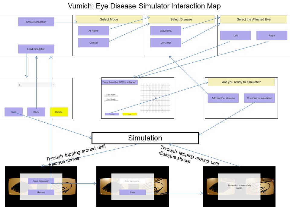
While my teammate worked on researching AR libraries and getting our new app off the ground, I focused my efforts on the user interface experience. My first step in redesigning the application was to map out the interactions in the existing application to examine the current interaction flow and get a comprehensive overview of the app. The app guides the user through a series of steps to set up and draw the blind spots that will be displayed during the simulation. However, the map reveals a linear flow of many steps, without any back buttons, as well as unclear visual indicators on how to interact after the simulation.
Heuristic Evaluation
Next, I did a usability analysis of the previous app using Nielsen's (1994) Ten Usability Heuristics, which are a set of general usability principles. I stepped through the app one heuristic at a time to analyze which principles were violated and which not. As a starting point to my design process, the heuristic evaluation and interaction map were a quick way to find the most egregious usability issues in the app without having to recruit others. As the sole UX researcher and designer, I needed to work quickly and begin designing as soon as possible.
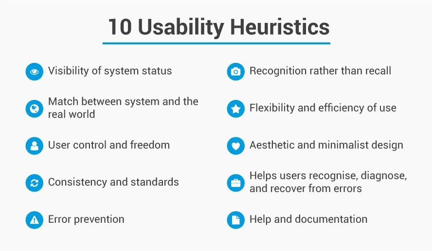
I found that the app had the biggest usability issues with regard to "User Control and Freedom," "Recognition Rather than Recall," and "Visibility of System Status."
- User Control and Freedom means that users should have the freedom to undo, redo, and make mistakes and be able to recover from them. The app had no back buttons, and any mistakes users made meant that the user had to start from the beginning again.
- Recognition Rather than Recall means that users should not be required to recall information. Instead, information should be displayed so users only need to recognize information. The app led users through a linear series of steps that required users to recall what they have already done.
- Visibility of System Status means that the system should keep users updated with what is happening and what the user's status is. The app did not show users' progress through the many steps before the simulation.
Wireframing
With information on the usability issues in the previous app, I sketched and wireframed screens. My goals were to:
- increase user control and freedom through the addition of back buttons
- decrease the number of linear steps involved and favor cyclical flows for more user mobility and understanding of system status
- have a tool for communicating design ideas to our developer
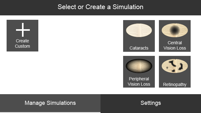
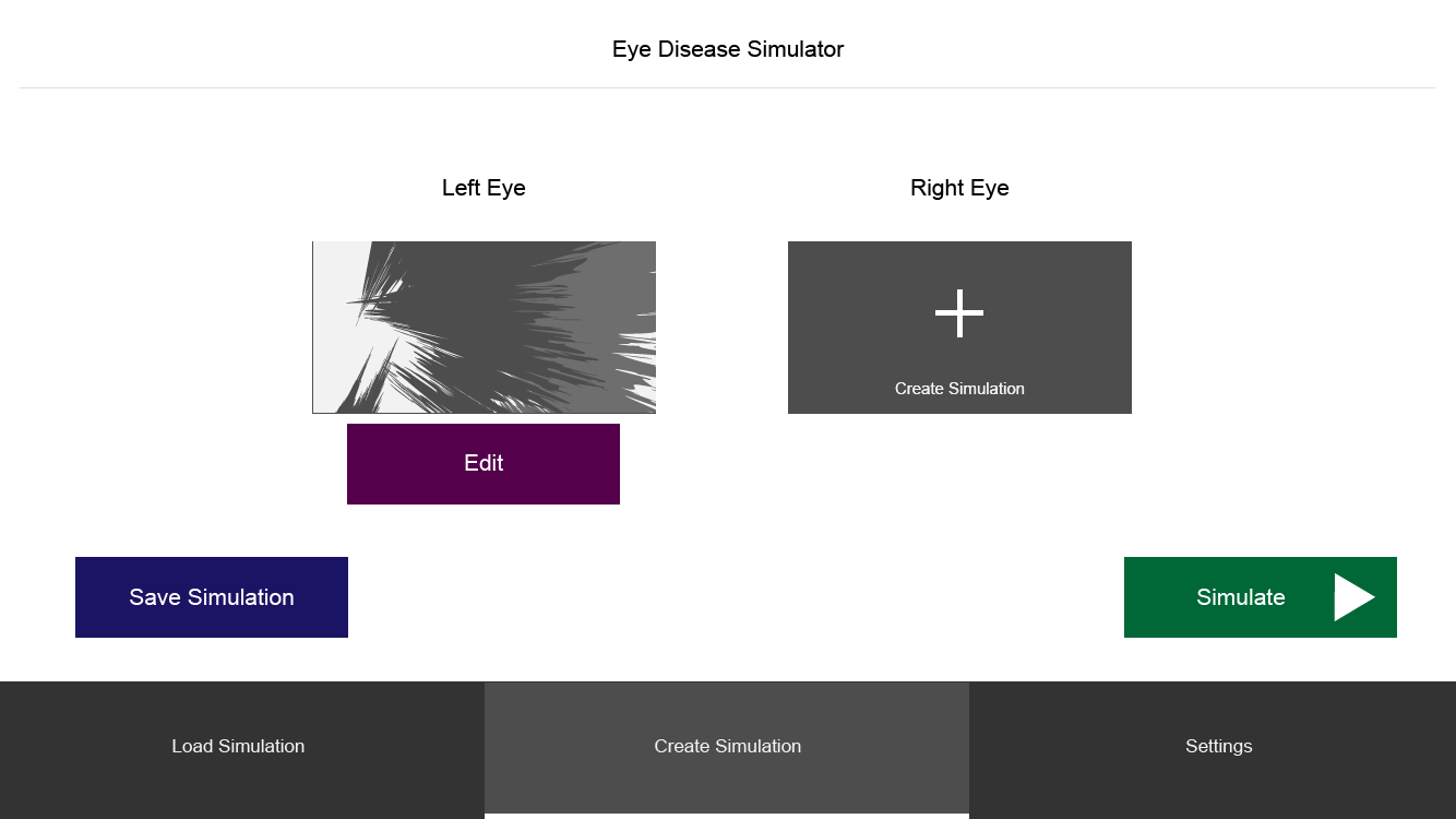
I designed a "home" area for each simulation so that instead of linearly doing the left eye then the right eye, users could have control over the order and see the progress of certain eyes as they inputted the blind spots for each eye. After creating the wireframes, I prototyped them using Marvel to illustrate interactions and flows.
Usability Testing
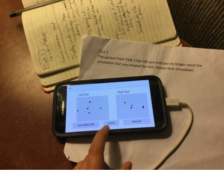
My work as a designer was not done without some usability testing to ensure that others could use the app. I needed feedback to improve my designs. Our advisor and team made the decision to do testing on the actual app instead of on my prototype because of development limitations. With only one developer, who was invested in debugging why the app was crashing and not invested in the front end, we wanted to test the interface of the actual app that the developer could build, not on the idealized version of the app that my prototype represented, which might never be realized fully by the developer.
I handed my wireframes over to our developer, who developed the front end and sent me the app in its current state. I then recruited two people to complete five tasks to complete using the app. As they attempted the tasks, I asked them to think aloud to explain their interaction choices. I observed them and took notes, trying to stay in the background as much as possible and let them figure things out. However, occasionally, the app would crash and close because the implementation was not complete and I would have to intervene. At the end of the sessions, I did a brief debriefing interview with the user to hear their thoughts.
Afterwards, I synthesized the behavior patterns I had been seeing, and wrote a report detailing my findings for my team. Some main findings were that:
- the pen size was too small, making for awkward and time-consuming drawing of blind spots
- there needed to be more confirmation dialogues. Most users did not know if they had successfully saved a simulation
- users did not know how to get to the drawing screen of the eye
- sizing and grouping of elements made users confused. The create simulation button was so large that people didn't notice other things on the screen, and the saved simulations were near the create button, making them seem more related than they were.
Iteration
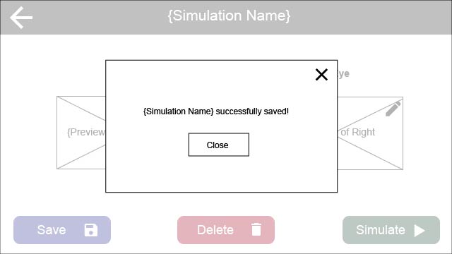
I used these findings to drive my design decisions as I improved upon the app. Several of the issues brought up in the usability tests were because of discrepancies between the design and the implementation. For example, in my design, there were pencil icons near each eye to indicate that users could edit and draw the blind spots for an eye. In the app, these didn't exist because it was challenging to implement given the time constraints. Other findings from the usability tests were things that I could change in the design. For example, I added more confirmation dialogues during critical moments in the flow, such as when people are saving or deleting simulations.
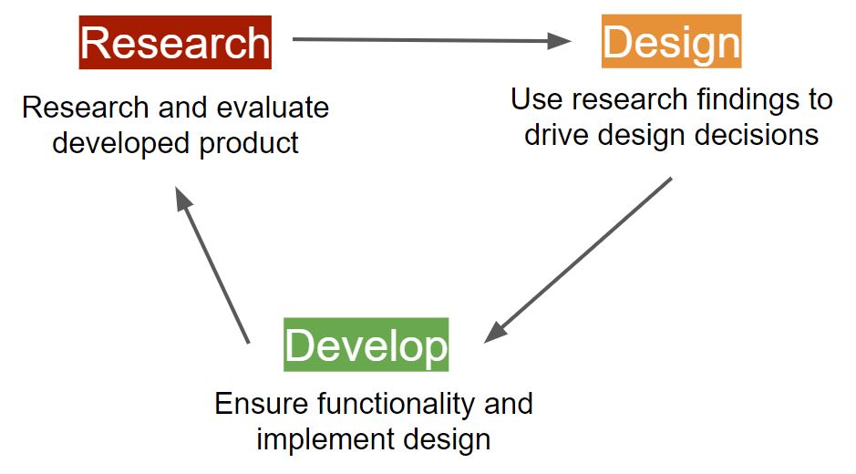
After sending our developer the new wireframes and prototypes, our developer made the front end changes and I did usability testing yet again with some users. Some of the findings were the same since certain parts of the interface had not been changed yet, but the rest of them were more specific and in-depth. We did two iterations of a research - design - develop cycle before the semester ended.
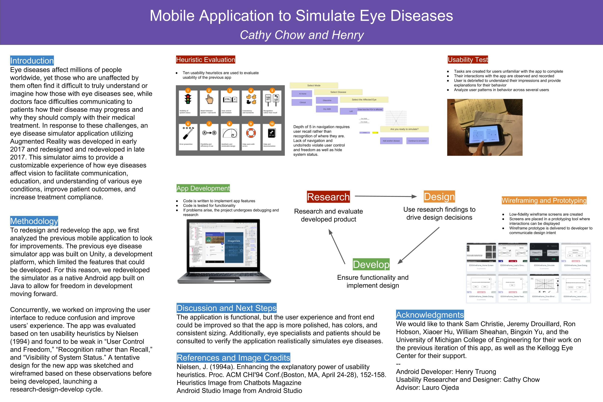
Presentation Poster
At the end of the year, our advisor was to present our work to our sponsors. For that presentation, he asked me to create the poster for him to use, which I was honored to do. My work was more visible and understandable to our stakeholders and sponsors than the code was. Here is the poster:
Lessons
This was a challenging project, but I am very happy to have been part of it! I got a glimpse into the world of working with people from other disciplines and understanding limitations. Some takeaways are:
- Not everybody knows or cares about UX and design. Advocate for UX by learning to talk their talk, whether that means bringing in research or drawing on their empathy as users themselves.
- Real-world limitations will cramp your usual design (and research) process - and that's okay! Adapt.
- Expect to communicate more when working in multidisciplinary teams. You will often have to teach UX concepts and provide supplementary background information that you don't normally have to do in a team of other designers.